Responsive Web Design and its Importance
- Best Practices
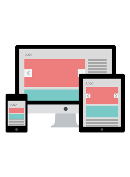
The term responsive web design has been derived from the currently popular responsive architecture wherein architects create structures that adapt to the movements of the people using them. In a similar fashion, responsive web design is adaptable to a vast variety of devices from large desktop computers to small hand held smart phones. Such web design is the need of the hour because technology is on a tenfold rise; advancing everyday and a wide range of new devices that can access the internet are launched every now and then. There was a time when people gave a lot of importance to the look and the feel of a website, but today it is no longer sufficient to have good looking websites. In fact, using flashy templates that represent the current short lived fad in website design tend to be more distracting than informative.
As to diversify, modern website designs aim at simplicity in design and being flexible at the same time. Often websites that don’t have a responsive design end up with jumbled text or distorted images on a hand held device, which is a negative in terms of search engine rankings. Why? Simply because humans may be able to make out and understand jumbled text, but the search engine spiders are unable to do so. As a result, the performance of the website on smaller devices will be poor and viewers will obviously go to a website that is more adaptable to their device. It is especially necessary to make website designs responsive because you don’t know what kind of device may be used to view your website.
Although the usefulness of responsive web design is quite obvious, it may be a little difficult to implement. It takes a lot of skills and knowledge to create this kind of website design. Different types of responsive image techniques, responsive design and conditional loading and server side components have evolved to help website developers. The technique of server side components, also known as RESS, aims at enhancing web performance with the help of a combination of server side and client side powers. This involves providing somewhat different requests to certain devices for a particular URL but using responsive methods for providing the content.
This process involves understanding each device and its functioning and then adapting the website design according to as many different devices as possible. The function of the server side markup determines the shown content and the responsive techniques of design decide how they will look. The entire process requires a lot of planning and coding, but the results are worth the effort for sure. Plus, if you have a highly responsive website design it will be accessible to a larger audience and hence will increase your target customer base. Due to the fact that mobile technology is advancing by leaps and bounds, it is not really possible to make a website design that is adaptable to each device available in the market which is why web designers lay emphasis on simplicity of layout, UX and coding. At the same time, a lot of effort is made in creating informative and quality content that is unique.
It is not just sufficient to upload pictures of the products and their prices if you are to launch an ecommerce website. Keep in mind that in a physical store, a customer would come to know about all the features and qualities of the product by asking questions. On the other hand, in a virtual market they have to rely on the information given on the websites, and if they do not find the information that they want, they will simply go to another website.
If you would like to speak with one of our consultants about responsive web design for your web site, contact Net-Craft, an experienced responsive web design developer in Arizona.